Northern Roots Bee Co.
Northern Roots Bee Co.
SERVICES
art direction
packaging design
brand strategy
YEAR
2019
INDUSTRY
education, retail
SERVICES
art direction
packaging design
brand strategy
YEAR
2019
INDUSTRY
education, retail
SERVICES
art direction
packaging design
brand strategy
YEAR
2019
INDUSTRY
education, retail
SERVICES
art direction
packaging design
brand strategy
YEAR
2019
INDUSTRY
education, retail
SERVICES
art direction
packaging design
brand strategy
YEAR
2019
INDUSTRY
education, retail
Northern Roots Bee Co. is a Bay Area–based honey bee education and management company dedicated to restoring healthy pollinator populations through community engagement and sustainable practices.
The goal of this project was to translate that mission into a packaging experience that feels both thoughtful and elevated—something that reflects the care, craftsmanship, and environmental ethos behind the product.
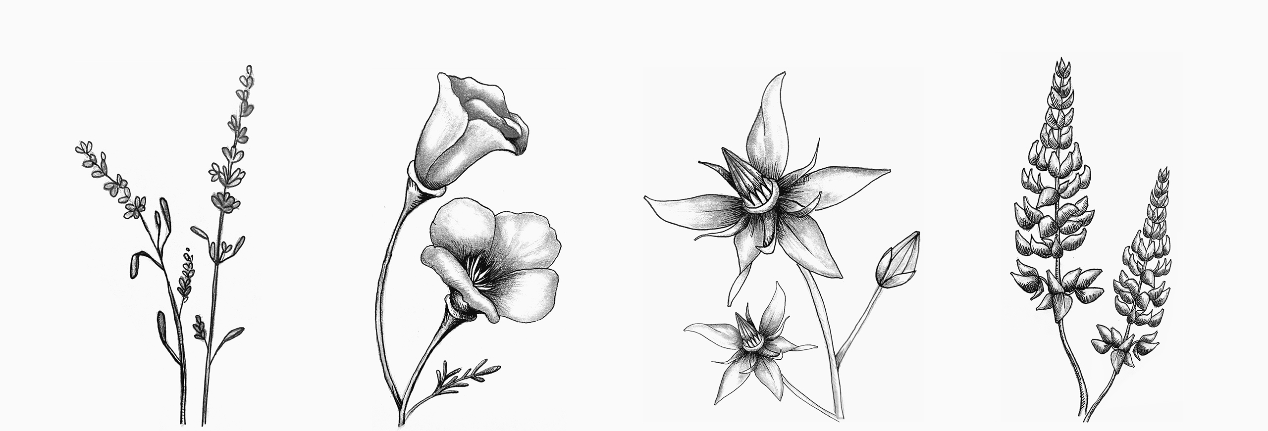
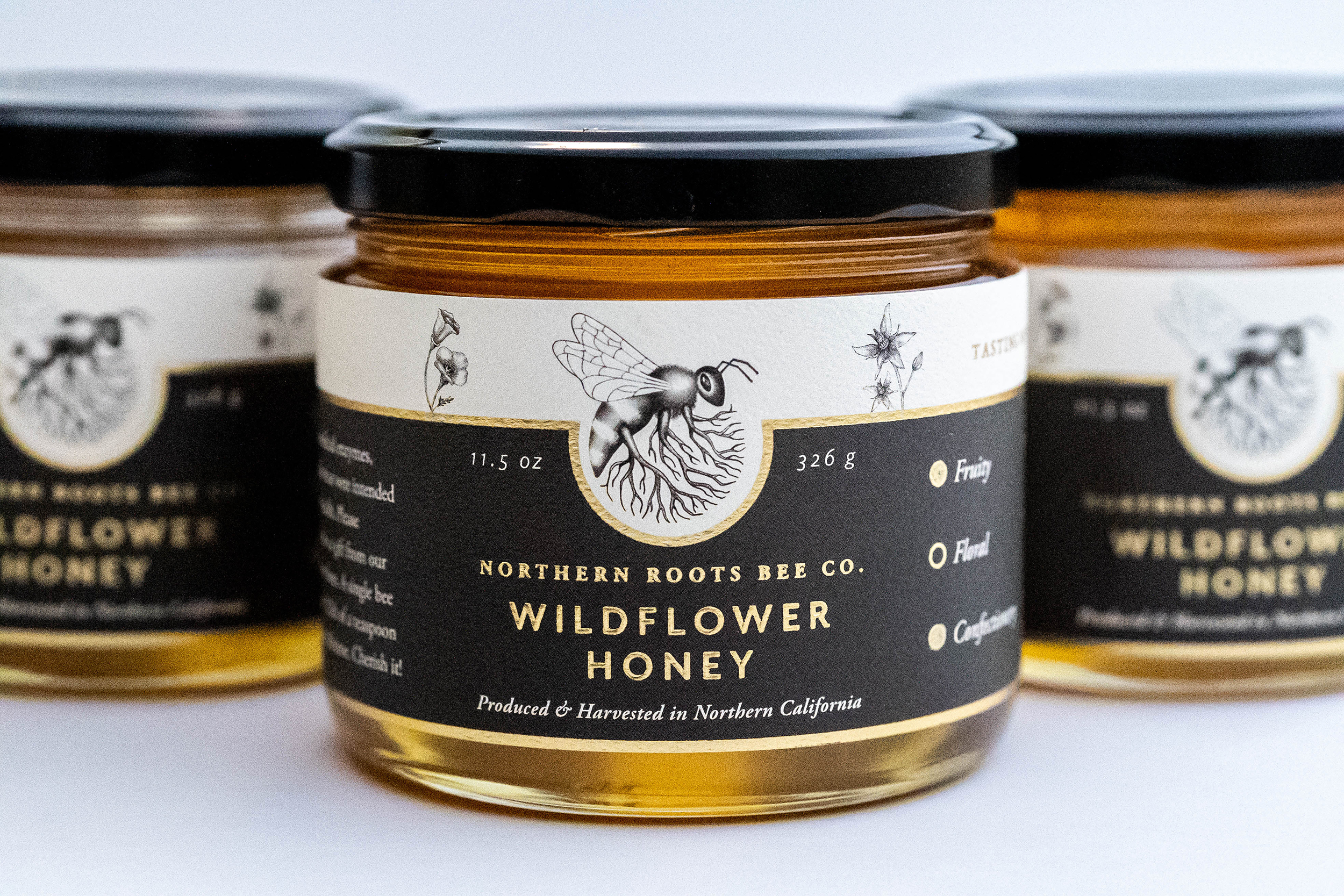
The design centers around a hand-illustrated logo, allowing it to anchor the composition while a series of delicate floral illustrations add warmth and a sense of place. These elements work together to create a visual language that feels organic, detailed, and quietly expressive—mirroring the natural world the brand is rooted in.
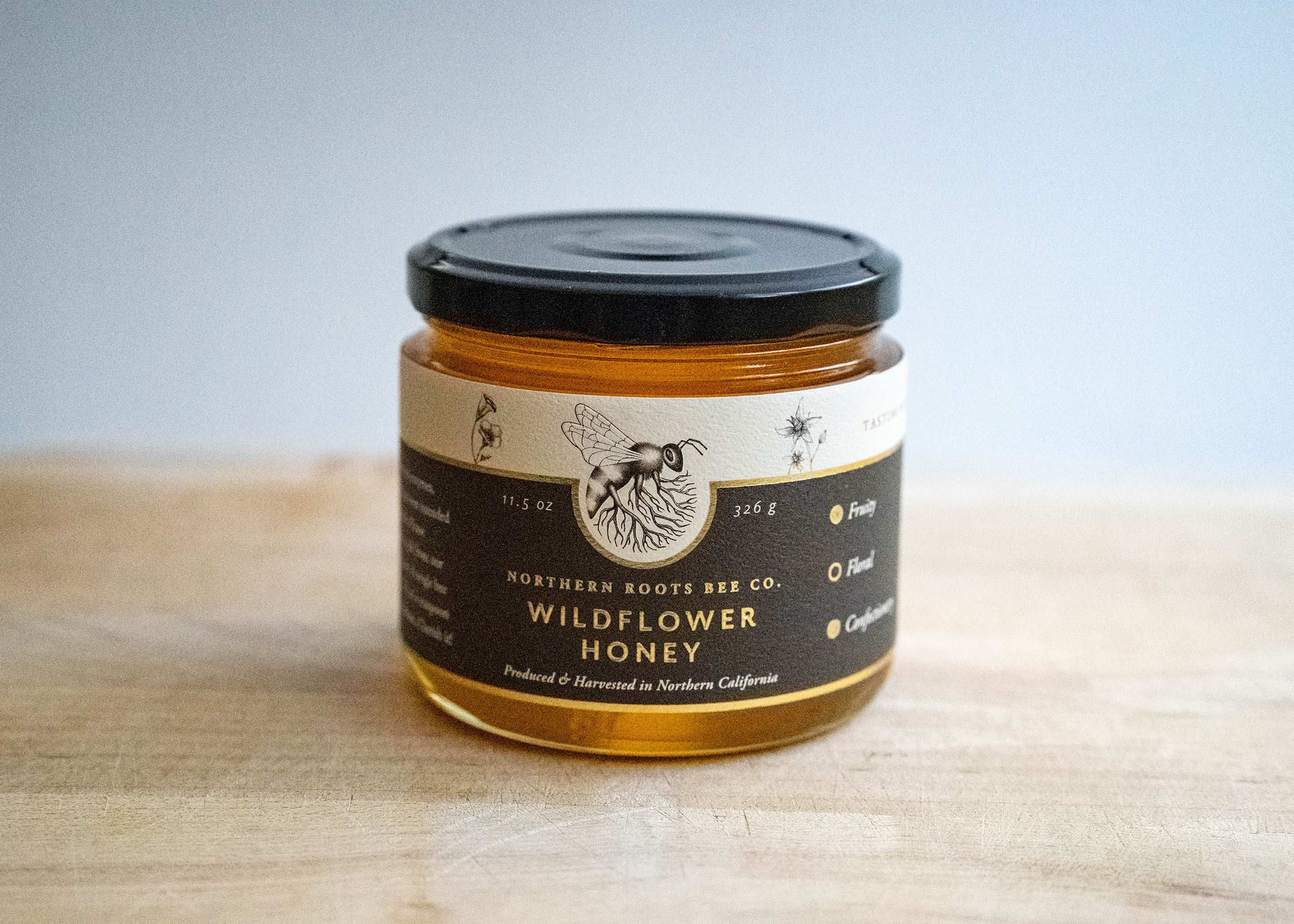
Material choices were equally intentional. The label was produced on textured paper with gold foil accents, introducing a subtle contrast between raw and refined—elevating the product while maintaining an authentic, handcrafted feel.
The final result is a packaging system that balances artistry with clarity, creating a shelf presence that feels distinctive, premium, and deeply connected to the brand’s purpose.
Northern Roots Bee Company is a start-up honey bee education and management company that aims to help restore healthy honey bee populations by installing and maintaining bee hives at residences, farms, universities, and businesses across the Bay Area.
I designed this label to showcase the hand-illustrated logo as the central element of the jar, and created various flower illustrations as decorative elements. The label is printed on textured paper with gold foil, to give it an artistic yet elevated look.
I designed this honey jar for Northern Roots Bee Company, a start-up honey bee education and management company that aims to help restore healthy honey bee populations by installing and maintaining bee hives at residences, farms, universities, and businesses across the Bay Area. I used the illustrated logo I had created for them as the central element of the jar, and created various flower illustrations as decorative elements. The label is printed on textured paper with gold foil, to give it an artistic yet elevated look.